Every team has that never-ending backlog of backlog components and feature requests that pile up faster than you can ship. Your inbox fills with “urgent” requests that all seem equally important. Without a clear way to decide what actually matters, you end up firefighting instead of making progress.
The impact vs effort matrix cuts through this noise. It’s a simple framework that forces you to be honest about what’s worth doing and what’s just noise.
What is an Impact vs. Effort Matrix?
An impact vs effort matrix is a 2×2 grid that plots tasks based on two factors: how much value they’ll create and how much work they’ll take. That’s it. No fancy formulas or complex scoring systems.
The vertical axis measures impact. This could be revenue growth, customer satisfaction, team productivity, or whatever metric actually moves the needle for your business. The horizontal axis measures effort, which includes organizational resource allocation, time, technical complexity, and the number of people involved.
The matrix isn’t new. It shares DNA with other prioritization tools like the Eisenhower Matrix (urgent vs important) and RICE scoring (reach, impact, confidence, effort). The difference is simplicity. Where RICE asks you to calculate four separate scores, the impact vs effort matrix keeps things visual and intuitive. This makes it perfect for team workshops where you need quick alignment, not endless debates.
The framework also connects to root cause analysis. When you’re fixing problems, the matrix helps you focus on solutions that address core issues without burning through your budget.
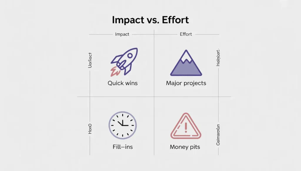
Decoding the 4 Quadrants: Which Tasks Actually Matter?
Once you plot tasks on the grid, four distinct quadrants emerge. Understanding each one helps you allocate resources strategically.
Quick Wins (Low Effort, High Impact)
These are your golden opportunities. Quick wins deliver meaningful results without draining resources. A button color change that increases conversions by 8%. A single email that brings back dormant users. A bug fix that makes customers stop complaining.
Quick wins do more than move metrics. They build momentum. When your team ships something valuable in days instead of months, morale goes up. Stakeholders see progress. Confidence builds.
The trap is overestimating how many quick wins you actually have. Teams often wishfully categorize medium-effort tasks as “quick” because they want them to be easy.
Major Projects (High Effort, High Impact)
These are your strategic bets. Building a new product line. Migrating your entire infrastructure. Redesigning your core user experience from scratch.
Major projects require serious planning. You need executive buy-in, dedicated resources, and often cross-functional coordination. The payoff can be transformative, but the timeline is measured in quarters, not weeks.
The mistake teams make is starting too many major projects at once. Your “high impact” initiative becomes “no impact” if you spread your team too thin and never finish anything.
Fill-Ins (Low Effort, Low Impact)
These tasks won’t change your business, but they’re easy to knock out. Updating old documentation. Tweaking a rarely-used settings page. Minor design polish on a forgotten feature.
Fill-ins have their place. Save them for Friday afternoons, developer downtime, or when someone’s waiting on feedback. They keep people productive without consuming focus during your peak hours.
The danger is letting fill-ins crowd out real work. It feels good to check off ten small tasks, but if none of them matter, you’ve just wasted a day.
Money Pits (High Effort, Low Impact)
These are the tasks that look impressive but deliver almost nothing. Rebuilding a feature that works fine. Adding complexity that only 2% of users will touch. Chasing a trend that doesn’t fit your product.
Money pits are tempting because they often sound strategic. Someone important requested it. A competitor has it. It involves cool technology. None of that matters if it won’t improve outcomes for your users or business.
Your goal is to identify money pits early and kill them. Every hour spent here is an hour stolen from work that actually matters.
How to Build Your Matrix: A Step-by-Step Workshop Guide
Building an impact vs effort matrix works best as a team activity. Here’s how to run an effective session.
Step 1: The Brainstorming Phase
Get everyone in a room (physical or virtual) and list every task, feature, bug fix, or initiative on the table. No filtering yet. No debates about feasibility. Just dump everything out.
Include product managers, engineers, designers, and even your newly integrated off-site talent who can provide fresh perspectives on the work. Marketing and sales perspectives matter too, especially when estimating impact.
Use sticky notes or a digital whiteboard tool. One idea per note. Aim for 20-30 items minimum. If you have fewer, you’re not being thorough enough.
Step 2: Defining Success Metrics
Before you start plotting, agree on what “high impact” means for your specific context. Is it monthly recurring revenue? User retention? Support ticket reduction? Customer satisfaction scores?
Pick something measurable. “High impact = 5% increase in conversions” is useful. “High impact = makes users happier” is not.
Do the same for effort. Define it in concrete terms. “High effort = 3+ months of engineering time” or “High effort = requires hiring additional staff” gives everyone a shared reference point.
TaskFino‘s team learned this lesson the hard way. Early prioritization sessions turned into arguments because the product team defined impact as “user satisfaction” while the executive team meant “revenue growth.” Neither was wrong, but without alignment, every decision became a fight.
Step 3: The Collaborative Plotting Session
Now place each task on the matrix. Start with the obvious extremes. The email campaign that takes two days and could bring back 500 customers? That’s a quick win. The complete platform rebuild will take a year? That’s a major project.
The interesting discussions happen in the middle. Is this feature medium impact or high impact? Does this bug fix count as low effort or medium effort?
Let the debates happen, but timebox them. Spend five minutes maximum on any single item. If the team can’t decide, it probably lands somewhere in the middle anyway.
Step 4: Consensus and Dot Voting
After the initial plotting, give everyone three dots (physical stickers or digital votes). Ask them to place dots on the tasks they believe are most wrongly positioned.
This surfaces disagreement fast. If one task has six dots on it, you know there’s a problem. Discuss those items as a group. Often, someone has information others don’t. The engineer knows the feature is harder than it looks. The designer has user research showing the impact is bigger than assumed.
Sometimes you won’t reach consensus. That’s fine. The product manager or project lead makes the final call, but now they’re making it with everyone’s input on the table.
Advanced Tips: Avoiding Common Prioritization Pitfalls
Teams that use the impact vs effort matrix for months start noticing patterns. Here’s what separates effective prioritization from busywork.
Don’t Overcomplicate Scoring
Some teams try to make the matrix scientific by adding numerical scales. Impact gets rated 1-10. Effort gets rated 1-10. Then they multiply the scores or create weighted formulas.
This rarely helps. It creates the illusion of precision where none exists. You don’t actually know if a feature is a 7.2 or a 7.8 on impact. The time spent debating those decimals is time wasted.
Stick with simple categories. High, medium, low. Or if you need more granularity, use a 1-5 scale. Anything more is overthinking it.
The Subjectivity Bias
The matrix feels objective because it’s visual. But every placement is still someone’s opinion. And opinions are often wrong.
Engineers underestimate effort because they forget about testing, deployment, and maintenance. Product managers overestimate impact because they’re excited about their idea. Executives declare something “high impact” because a single customer asked for it.
Fight this with data. When someone claims a feature will increase retention, ask to see the user research. When someone says a task will take two weeks, ask them to break down the specific work involved. The more you ground placements in evidence instead of intuition, the better your decisions become.
External Factors
The matrix focuses on internal factors: your team’s effort and your product’s impact. But the outside world matters too.
Maybe a competitor just launched a feature you were calling a “fill-in.” Suddenly it’s a quick win because users are actively comparing you. Maybe a new regulation changes the impact of compliance work from low to critical.
Watch the market, monitor competitors, and keep pace with the shifts of a fluid modern workplace to ensure your priorities remain relevant. The matrix should reflect reality, not just your internal assumptions.
Regular Iteration
Your matrix goes stale fast. A major project from six months ago might be a quick win today because you’ve built the necessary infrastructure. A quick win becomes a money pit when user needs shift.
TaskFino re-evaluates their matrix every sprint. Not every task gets reploted, but the team reviews the quadrants and moves things around based on new information. This takes 30 minutes and prevents them from building outdated priorities.
Some teams do quarterly deep dives where they rebuild the matrix from scratch. Both approaches work. What doesn’t work is creating the matrix once and never touching it again.
Real-World Examples: From SaaS to Healthcare
The impact vs effort matrix works across industries. Here’s how different teams apply it.
SaaS Development
A project management tool was deciding between building a viral sharing feature and rewriting their backend architecture. The sharing feature landed in the quick win quadrant. It would take two engineers three weeks and could drive 20% more signups through word-of-mouth.
The backend rewrite was clearly a major project. Six months of work, high risk, and the main benefit was making future development easier. Important, but not urgent.
They shipped the sharing feature first. It worked. New signups increased 17%. That success bought them the runway to tackle the backend rewrite later with more resources.
Marketing Strategy
A B2B company plotted its marketing initiatives. An email nurture campaign targeting inactive leads was a quick win. The copy was already written, the list was segmented, and they could launch in days. Expected impact: reactivate 5-10% of dormant prospects.
Developing a full mobile app for field sales reps was a major project. Months of development, coordination with sales, training, and rollout. High impact if it worked, but massive effort.
They ran the email campaign immediately while putting the mobile app into a proper planning phase. The campaign worked well enough that they actually postponed the app to focus on doubling down on email marketing, which had better ROI.
Root Cause Analysis
A hospital was reducing medication errors. Manual checks required nurses to verify patient information at every step. This was high effort (time-consuming, exhausting) with medium impact (caught some errors but not all).
Implementing barcode scanning at medication administration was initially thought to be high effort. But after breaking down the work, it turned out to be a major project with high impact. The effort was justified because it would nearly eliminate a specific category of errors.
They prioritized the barcode system and saw a 40% reduction in medication errors within three months of rollout.
FAQ
What are the 4 quadrants of the impact effort matrix?
The four quadrants are Quick Wins (high impact, low effort), Major Projects (high impact, high effort), Fill-Ins (low impact, low effort), and Money Pits (low impact, high effort). Quick wins should be your top priority, followed by major projects when you have the resources.
How do you calculate the impact and effort score?
Define specific metrics for your context first. Impact might be measured in revenue growth, user satisfaction scores, or conversion rate improvements. Effort includes time, money, people, and technical complexity. Use a simple 1-5 scale or just high/medium/low categories. Keep it simple and base scores on data when possible.
Is an Impact vs. Effort matrix the same as an Eisenhower Matrix?
No. The Eisenhower Matrix uses urgent vs. important as its axes and focuses on personal time management. The impact vs effort matrix uses value vs. resources and is typically used for team or business prioritization. Both are 2×2 grids, but they solve different problems.
What is the difference between effort and impact?
Effort is what you put in: time, money, people, and the complexity required to complete a task. Impact is what you get out: the measurable benefit to your business, users, or team. A task can be low effort but high impact (quick win) or high effort but low impact (money pit).
How can a product manager avoid bias when using the matrix?
Ground decisions in data instead of opinions. Back impact estimates with user research, analytics, or customer feedback. Have engineers break down the effort into specific work items. Include diverse perspectives in plotting sessions. Use dot voting to surface disagreements. And revisit the matrix regularly as you learn more.
Can you use an Impact vs. Effort matrix for personal productivity?
Yes, though it works better for project-level decisions than daily tasks. Plot personal goals or side projects to see which ones deserve your limited time. The matrix helps you avoid spending months on something that won’t meaningfully improve your life or career.
What tools are best for creating a digital prioritization matrix?
TaskFino includes built-in prioritization tools that let teams plot and track work using customizable matrices. Other options include Miro, Mural, and FigJam for collaborative whiteboarding. Even a simple spreadsheet with scatter plot functionality works. The tool matters less than having the right people in the room making honest assessments.